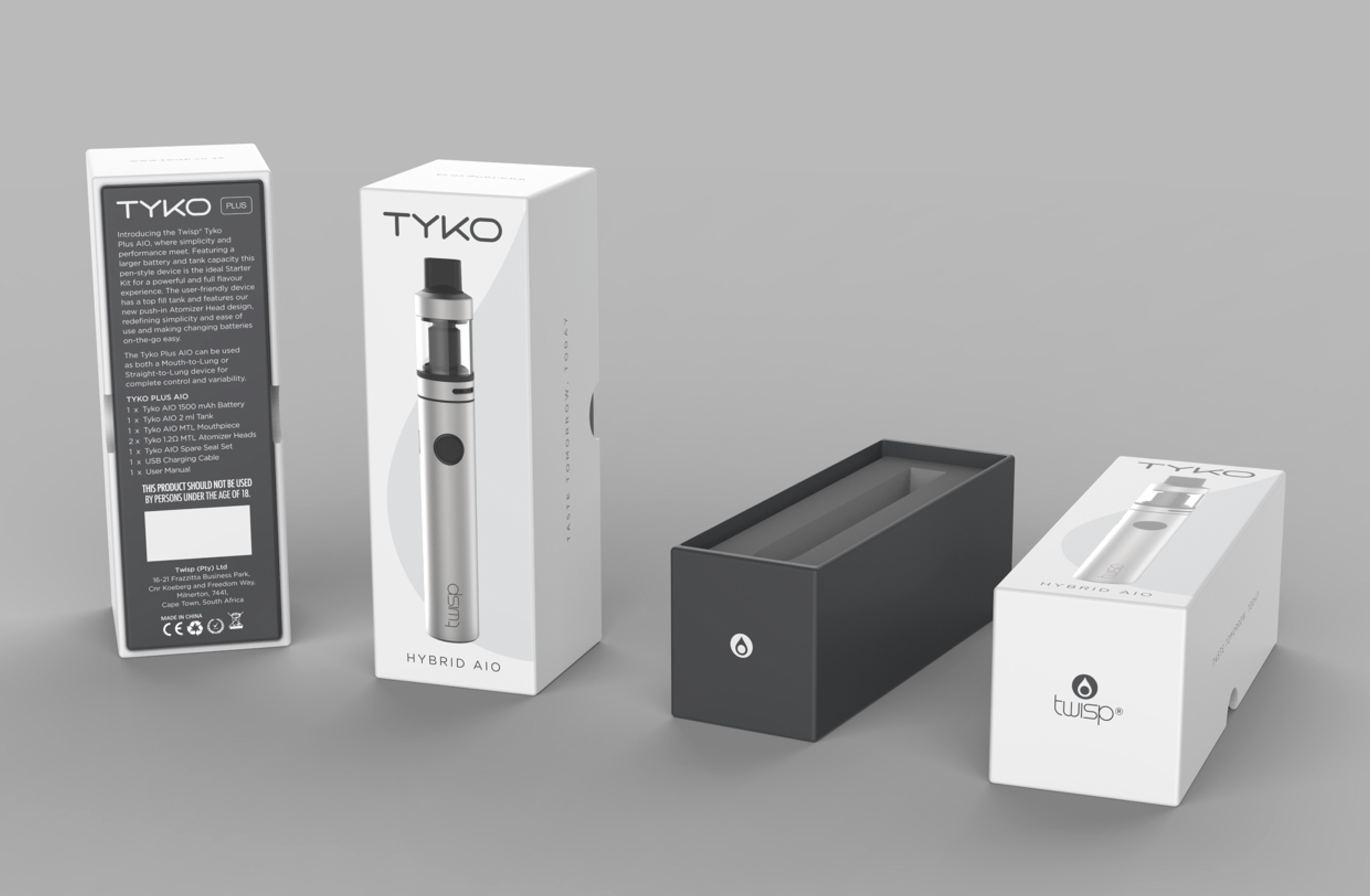
Tyko Plus introduced a modern, minimal aesthetic into the Twisp range. The design leaned into tech-forward simplicity with clean lines, soft geometry, and a visual language that felt more Apple than analog. Compared to Clearo or Arcus, this was the sleekest and most unisex of the lineup.
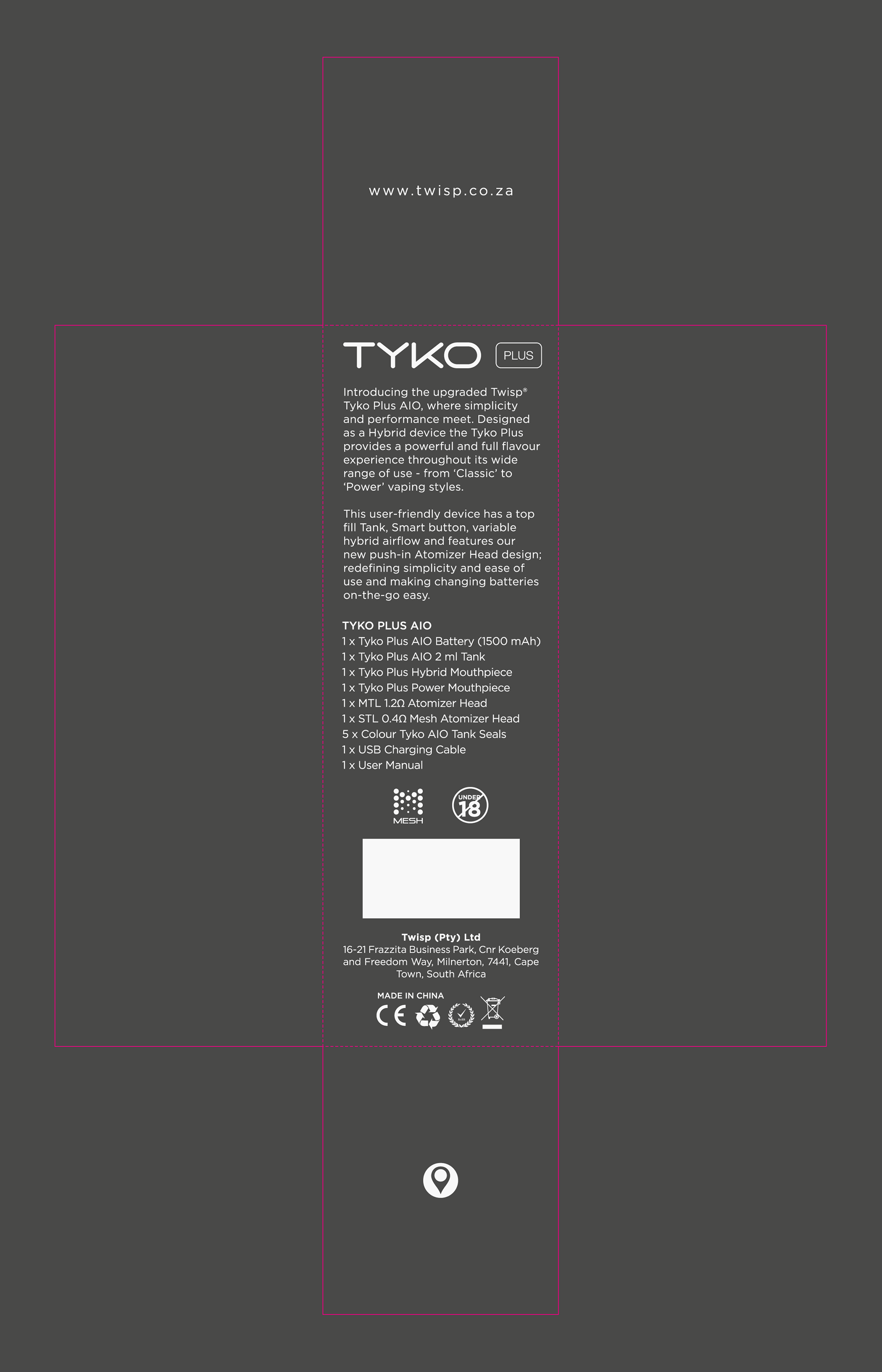
I developed the logo and packaging system, making sure every element from the outer box to the accessories felt cohesive and current. The marketing campaign followed suit, rolling out across print, digital, and social with clean, confident visuals.
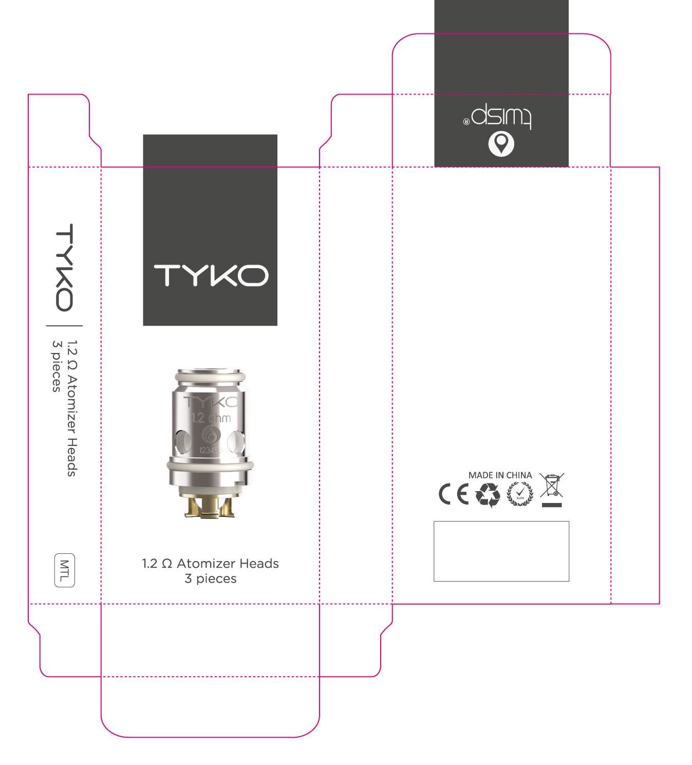
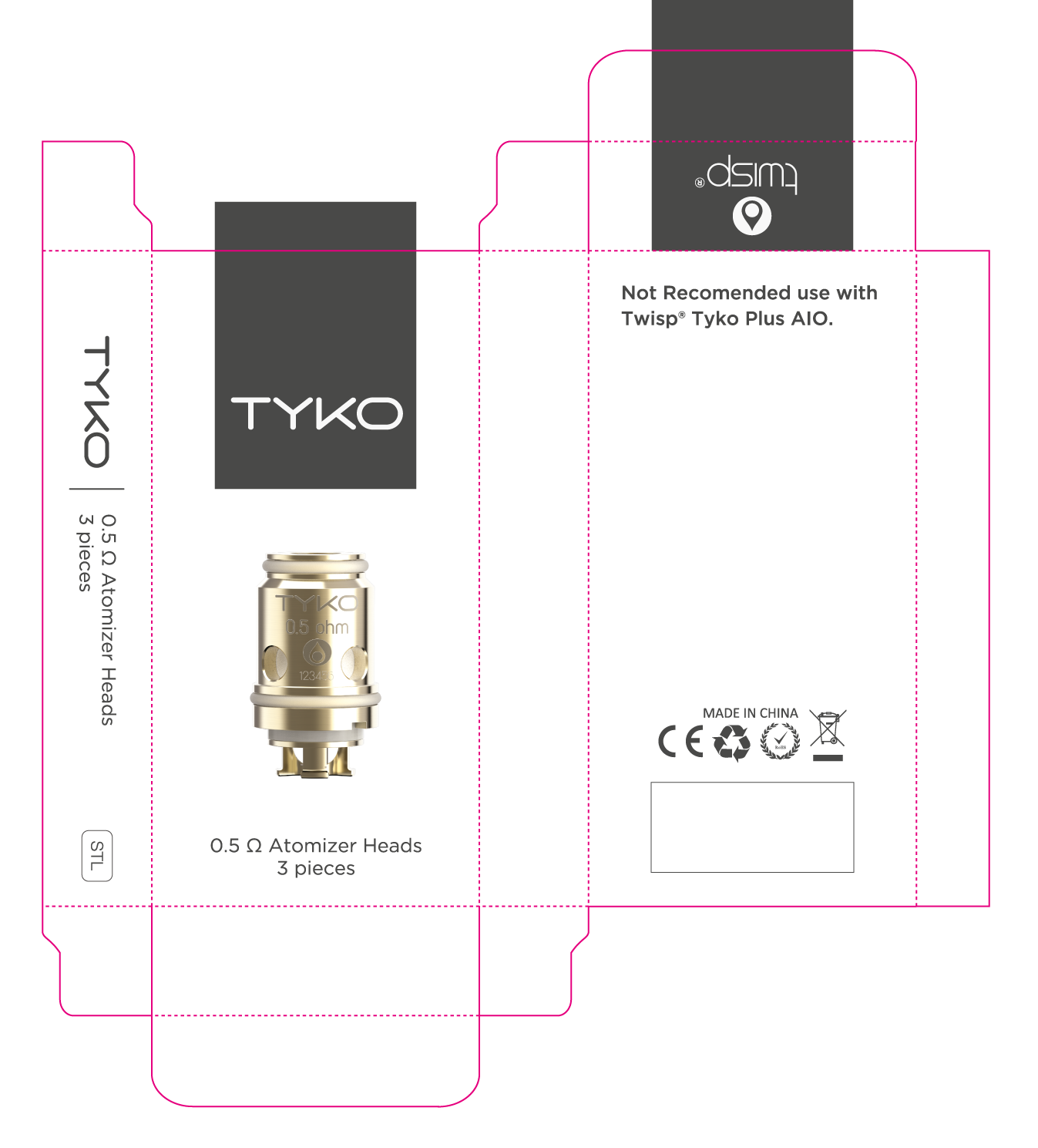
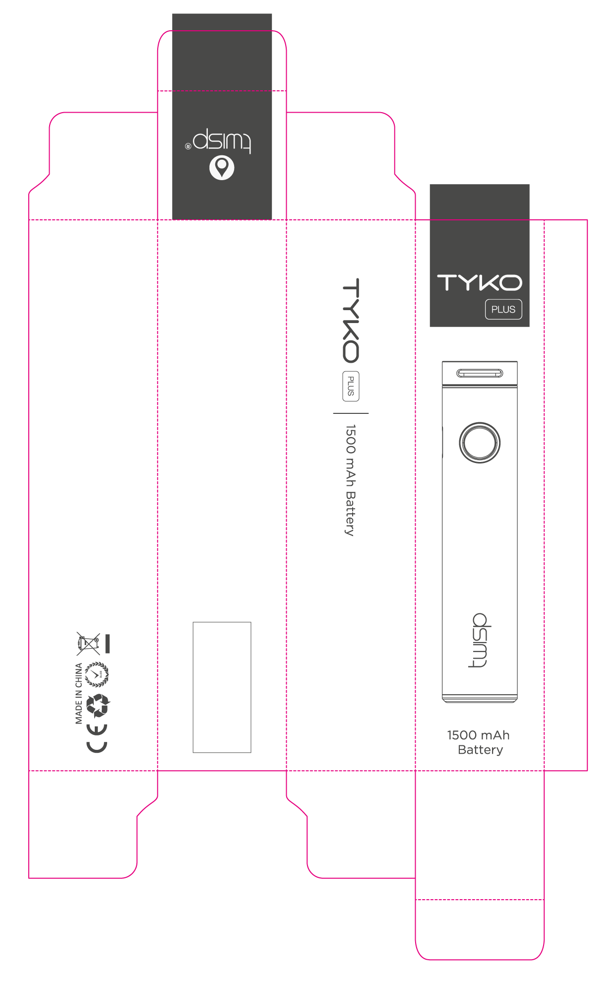
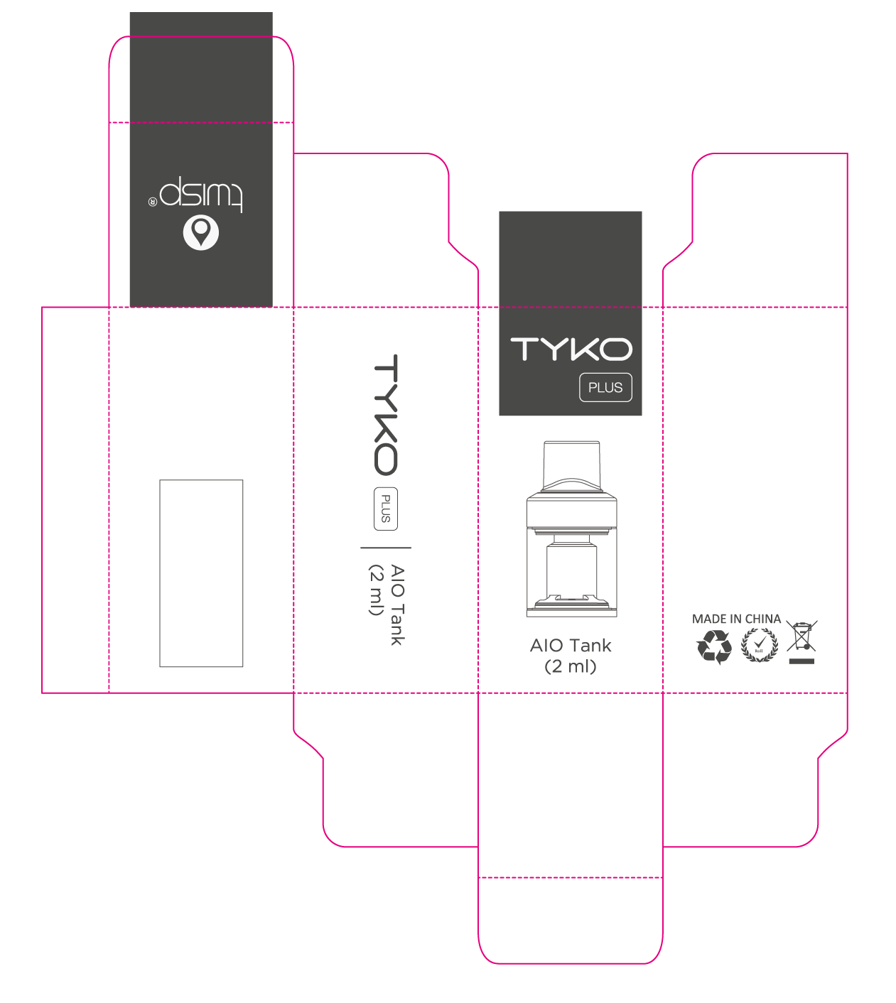
Below is a snapshot of the Tyko Plus look and feel, designed to speak to users who wanted something smart, stylish, and a little bit different.
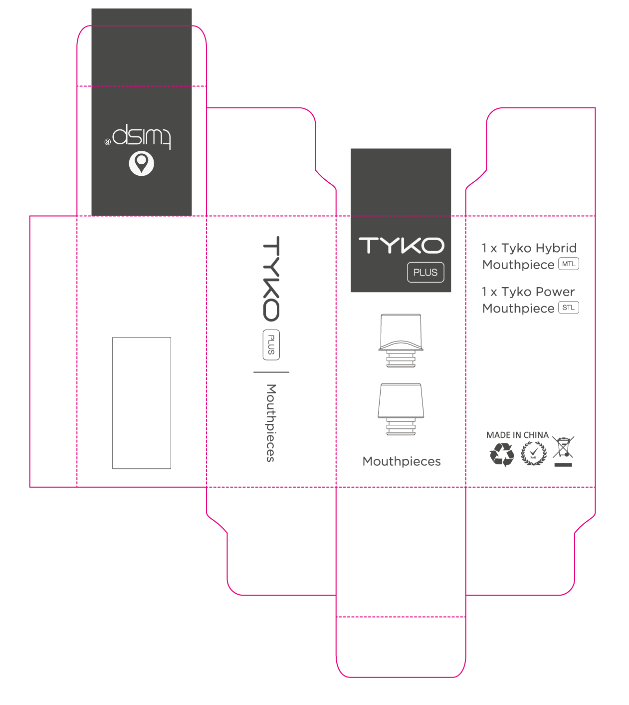
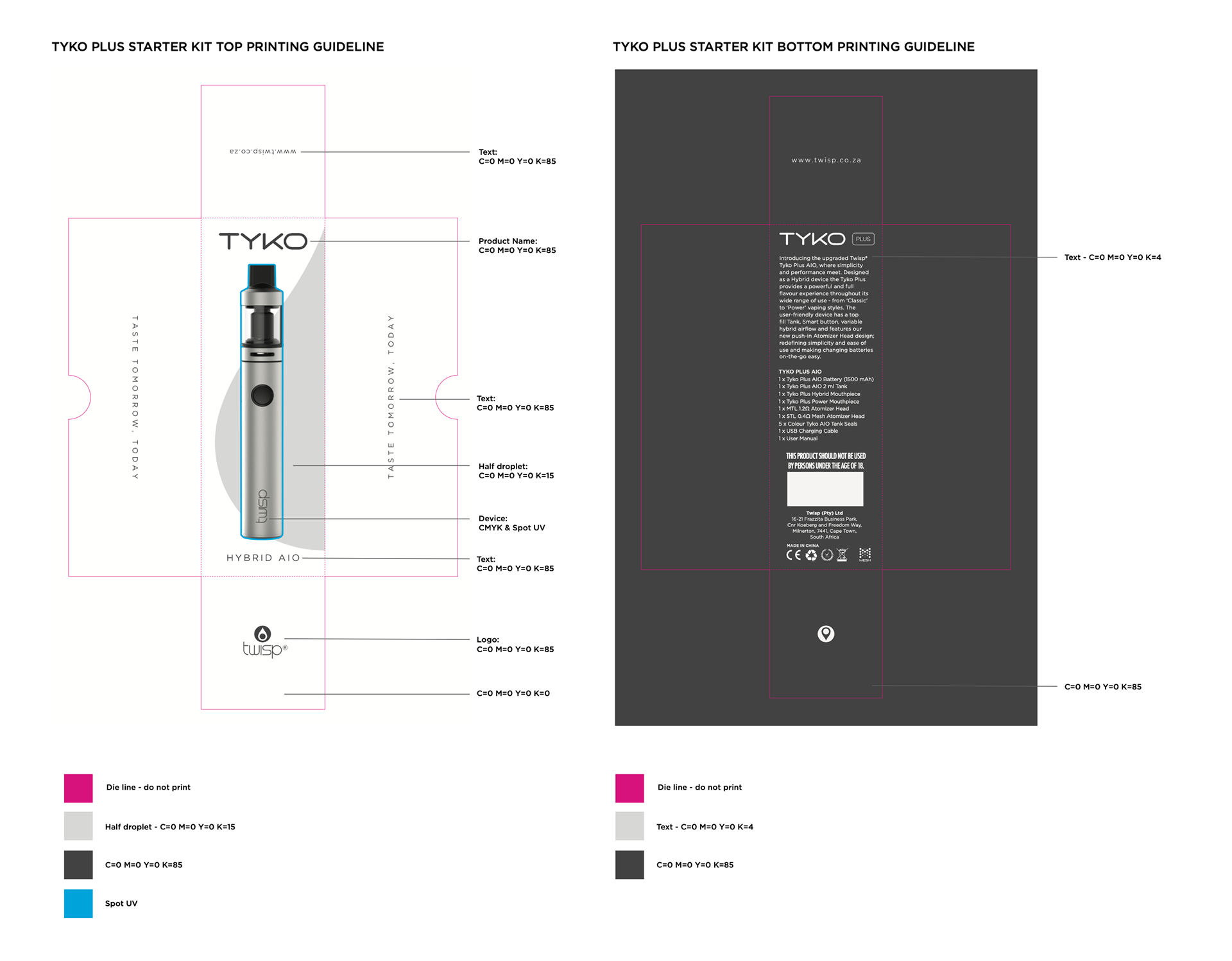
PACKAGING RENDERS

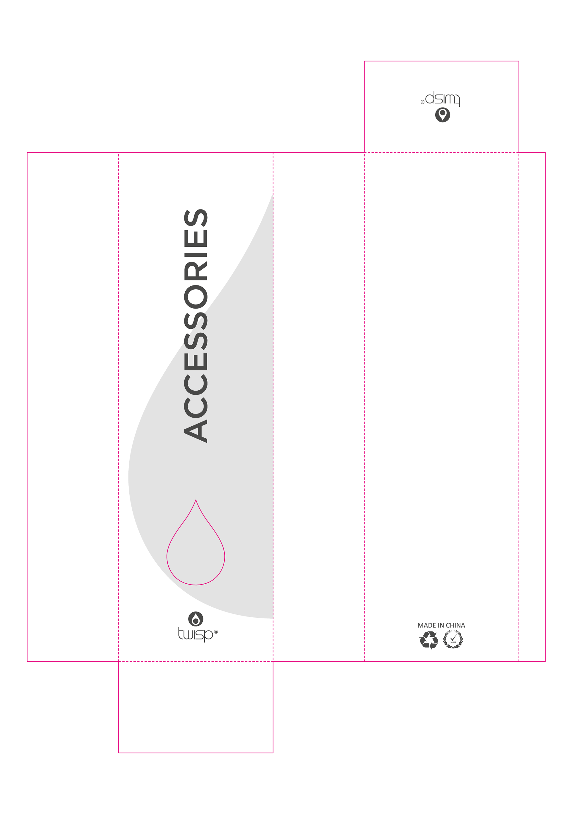
PACKAGING DESIGN


CAMPAIGN COLLATERAL

Taste + Change
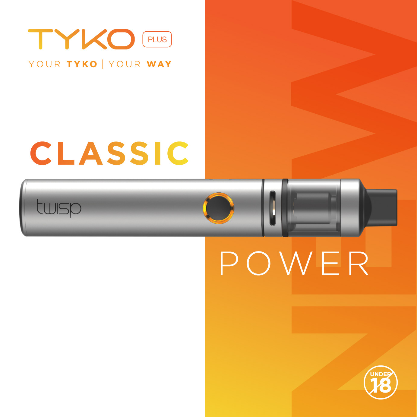
Classic + Power

Form + Function

Packaging & Marketing Design: Samantha Morrison - Product Design: Mic Lazzari - Rendering: Heinrich Botha