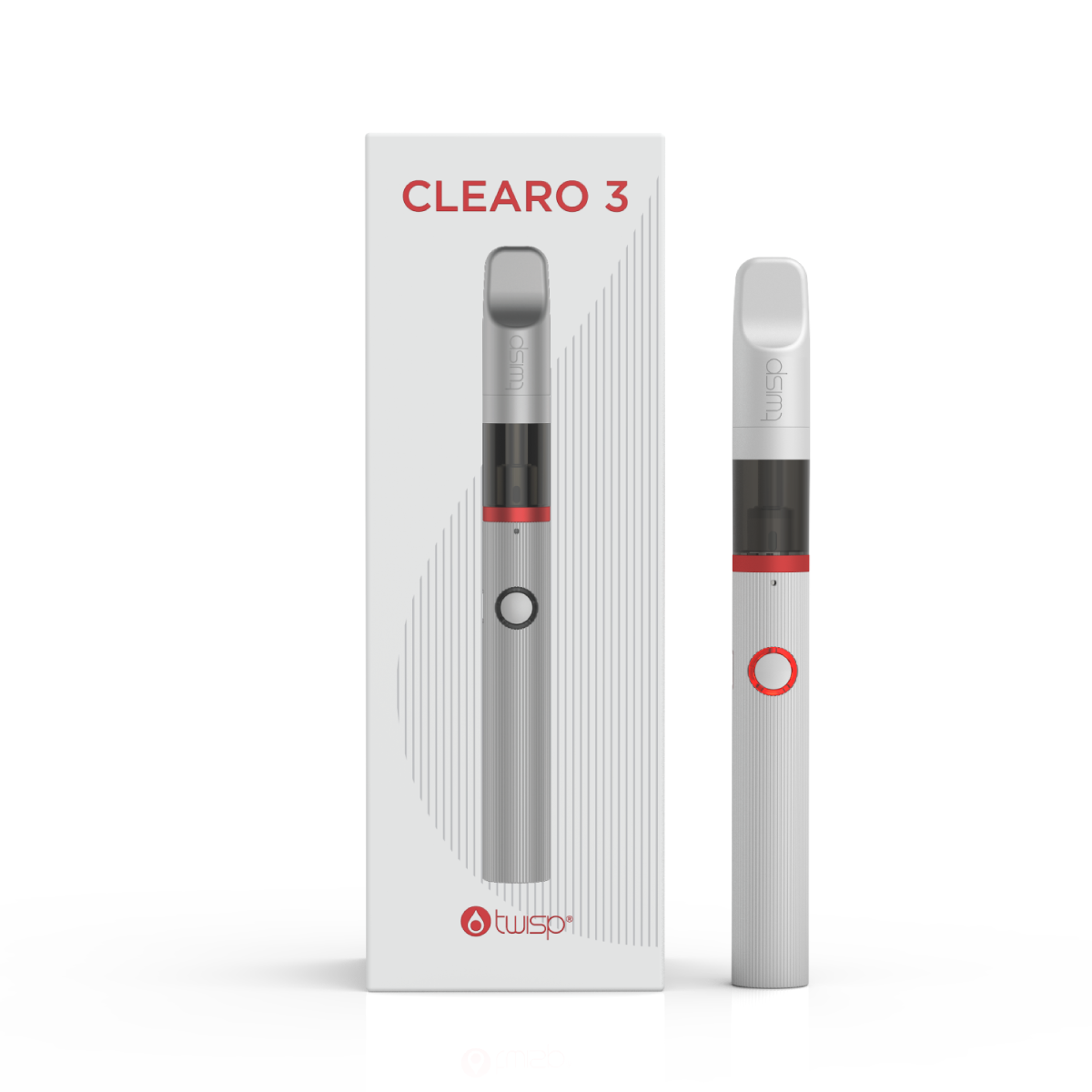
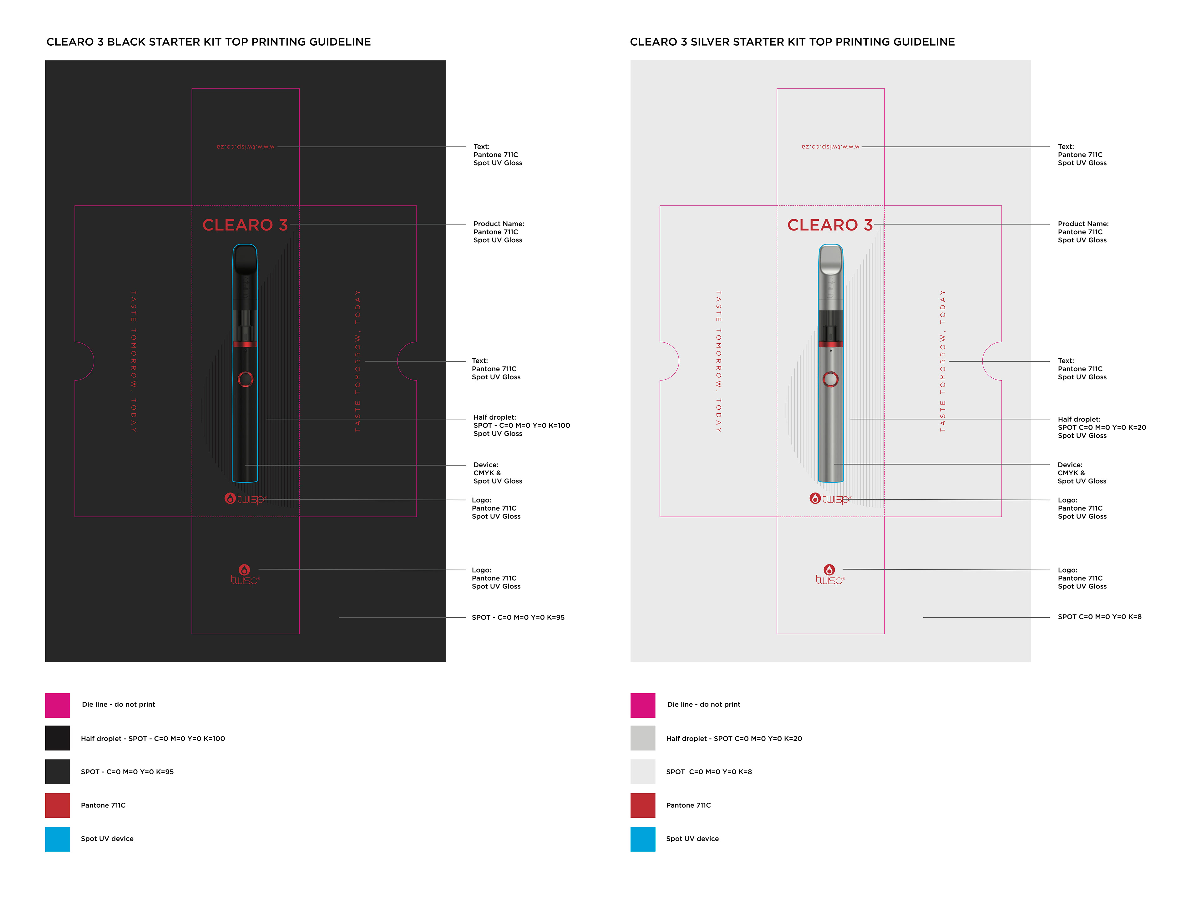
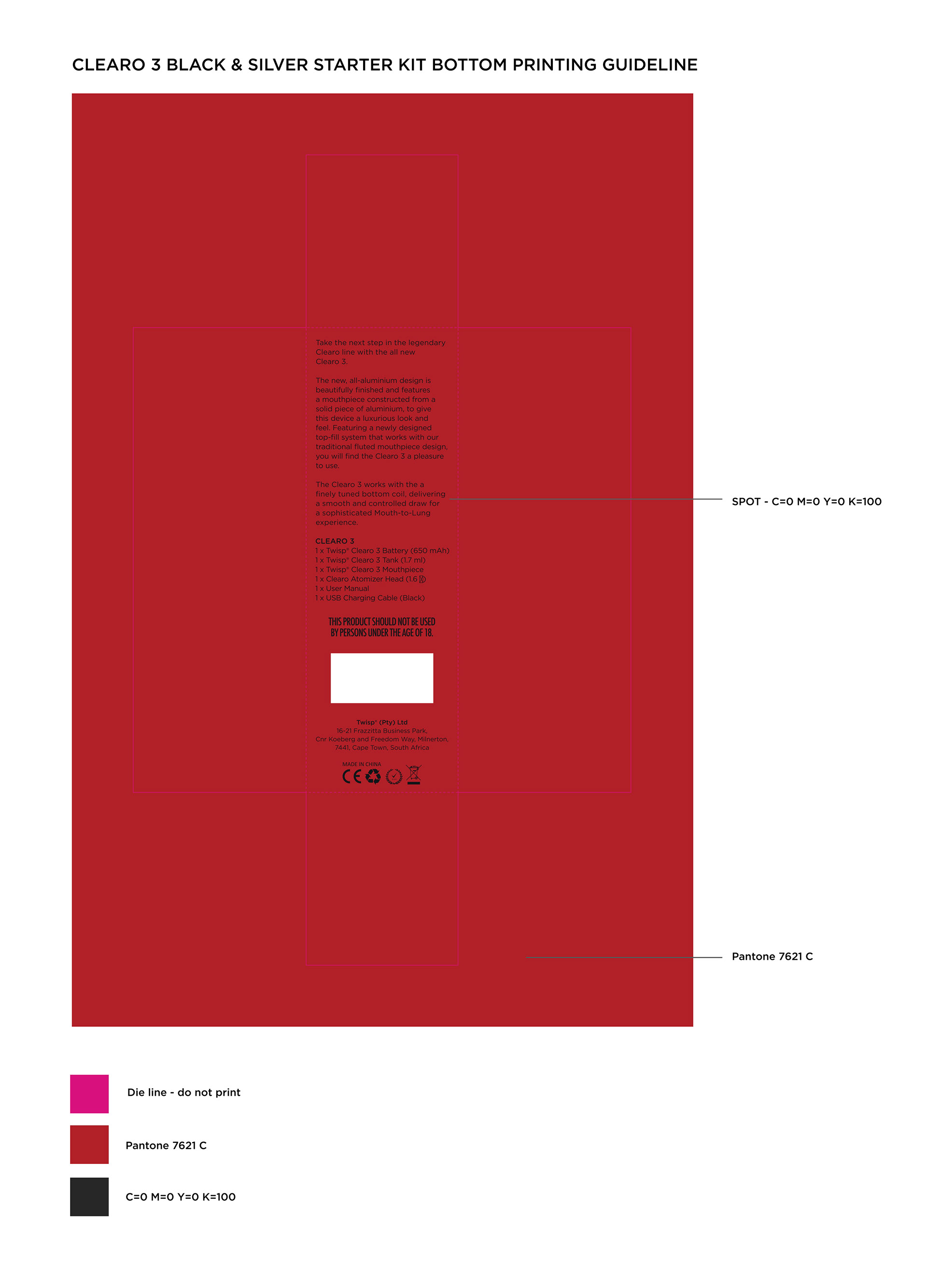
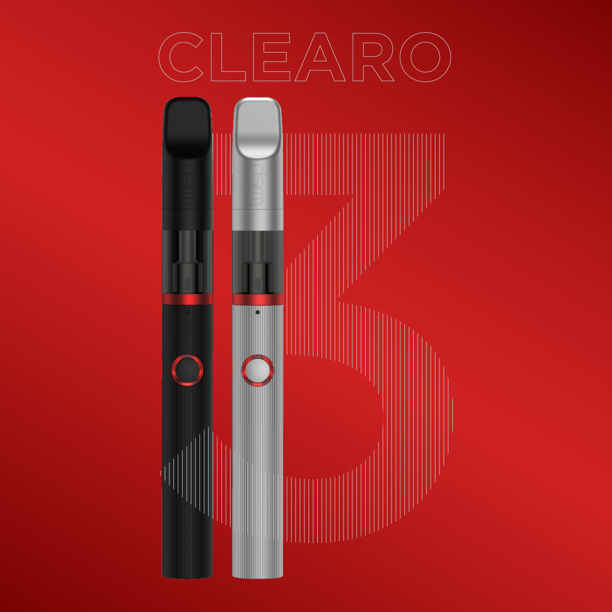
Clearo 3 was all about blending classic form with thoughtful design. It had a machined finish, a sculpted mouthpiece, and a red accent that gave it just the right amount of attitude. The experience felt premium, nostalgic, and purposefully refined.
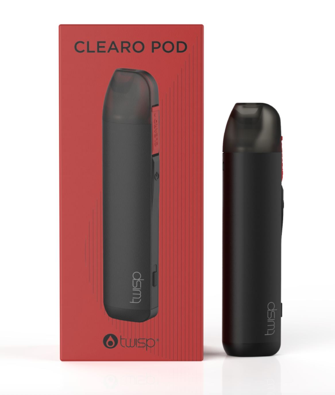
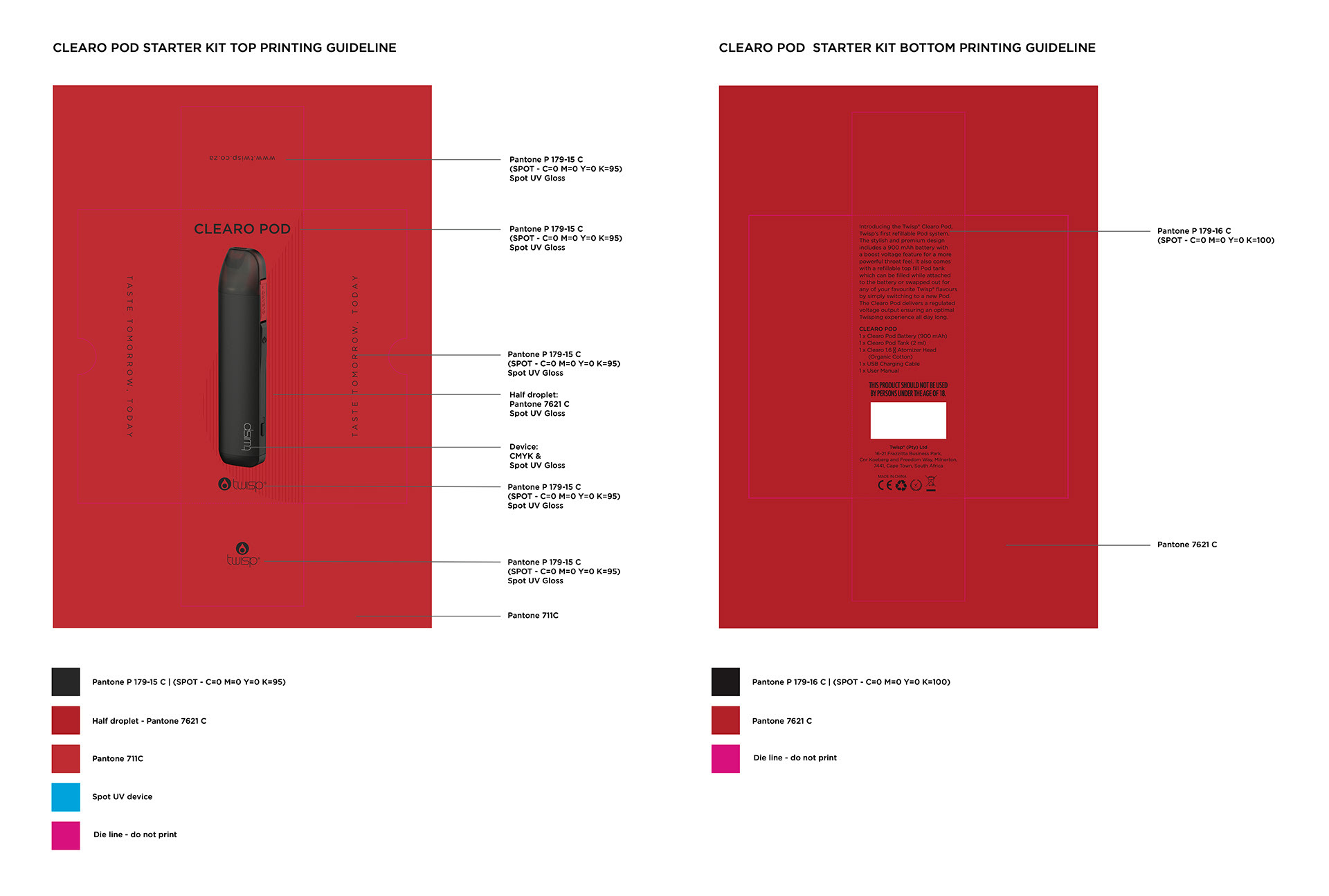
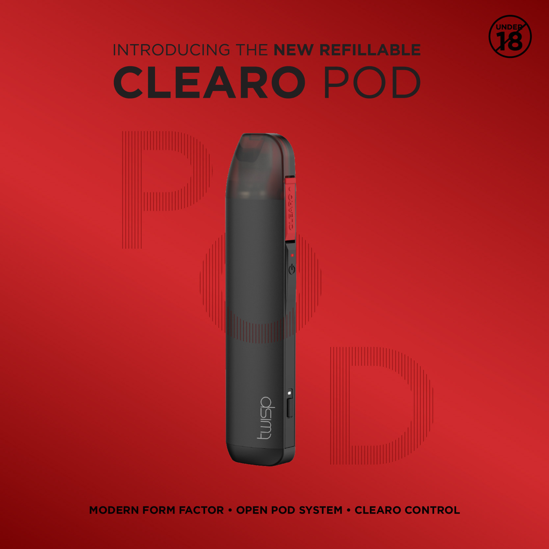
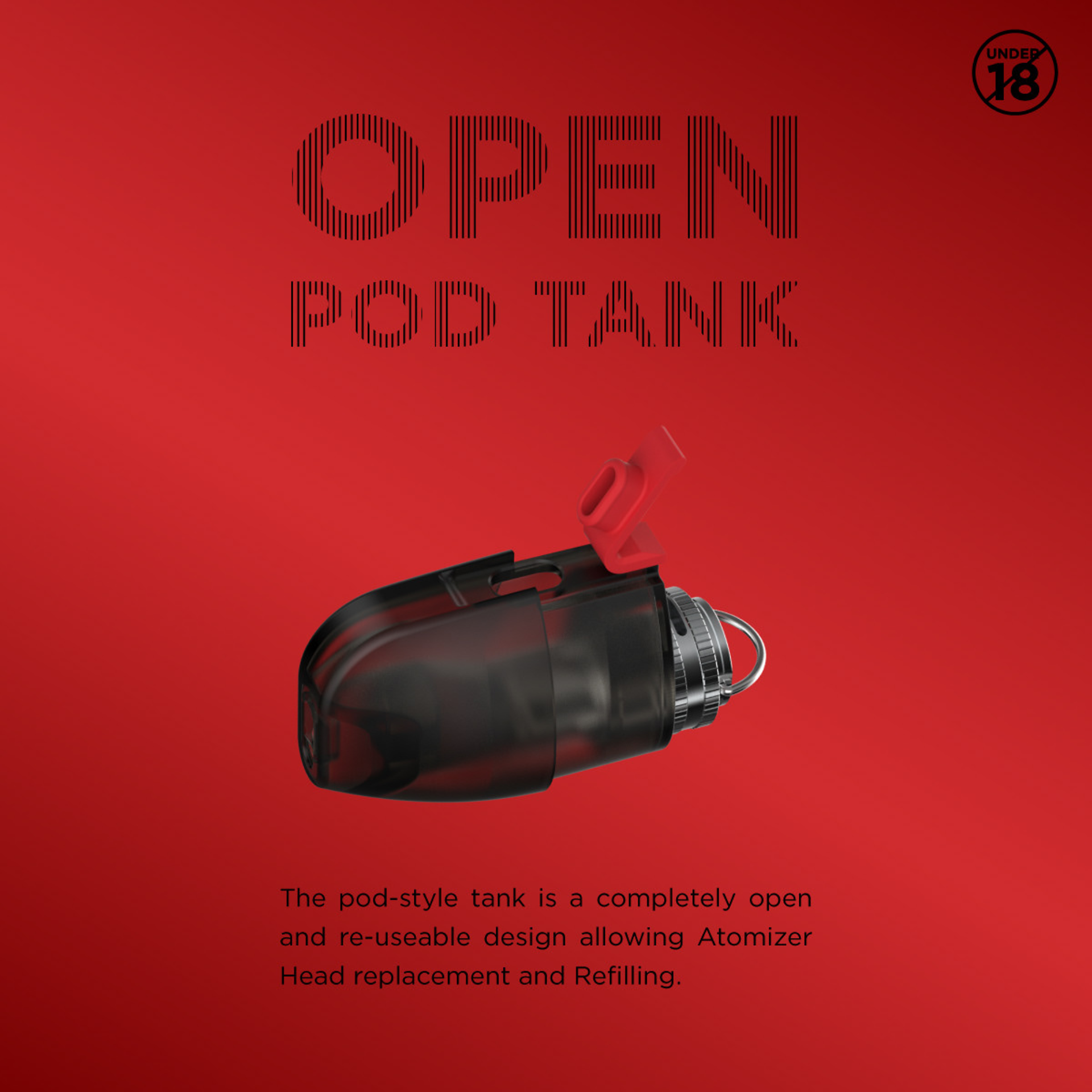
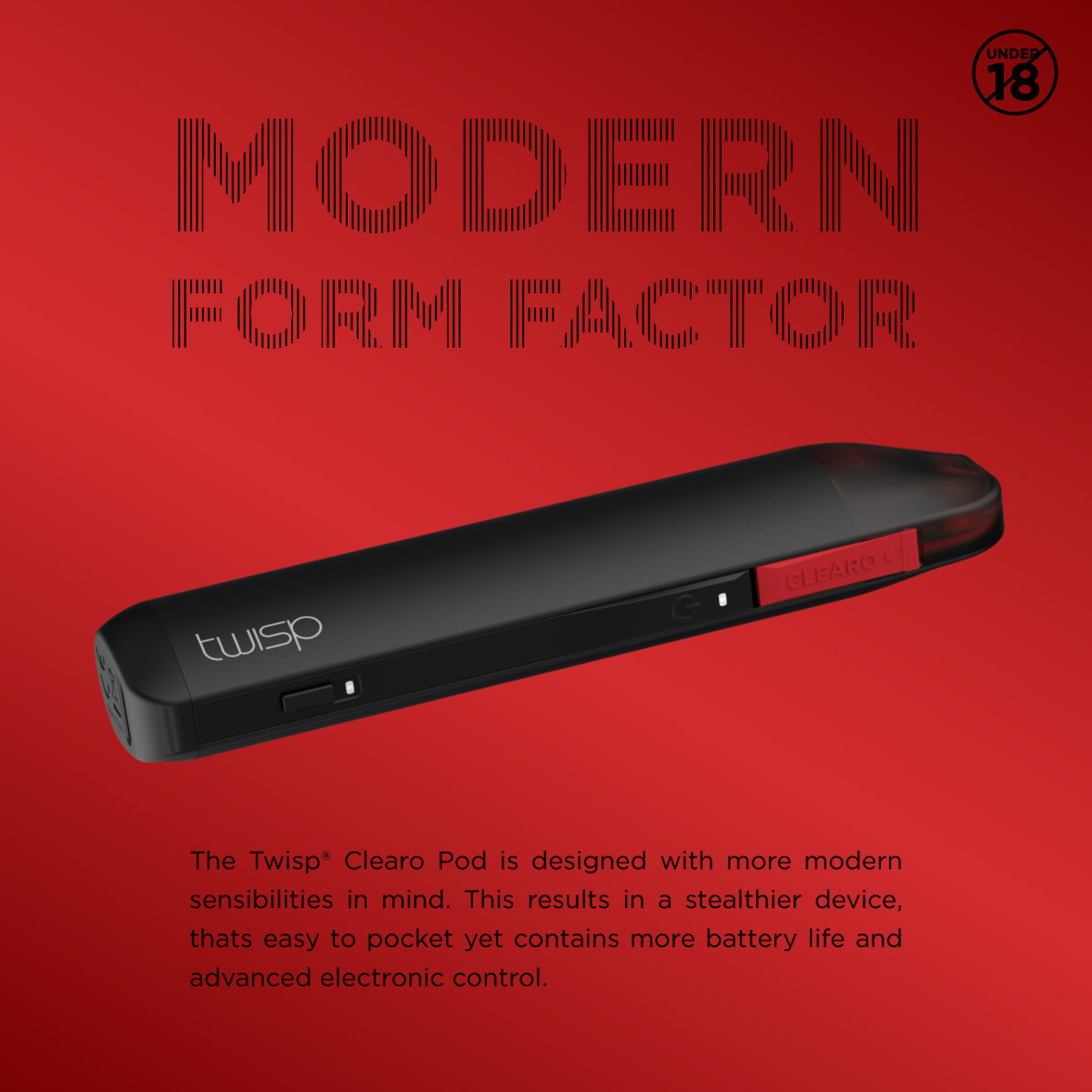
Clearo Pod followed suit, offering the same coil performance in a refillable, interchangeable system. It was built for users who wanted flexibility without giving up quality.
I worked on the full packaging suite for both products and helped roll out the supporting campaign across print, digital, and social. Below is a look at the creative direction and visuals that brought this range to life.
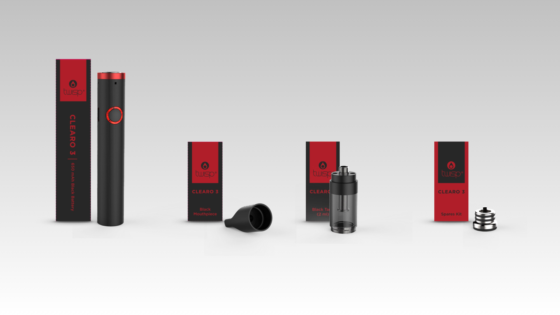
CLEARO POD & THE BLACK CLEARO 3


THE SILVER CLEARO 3

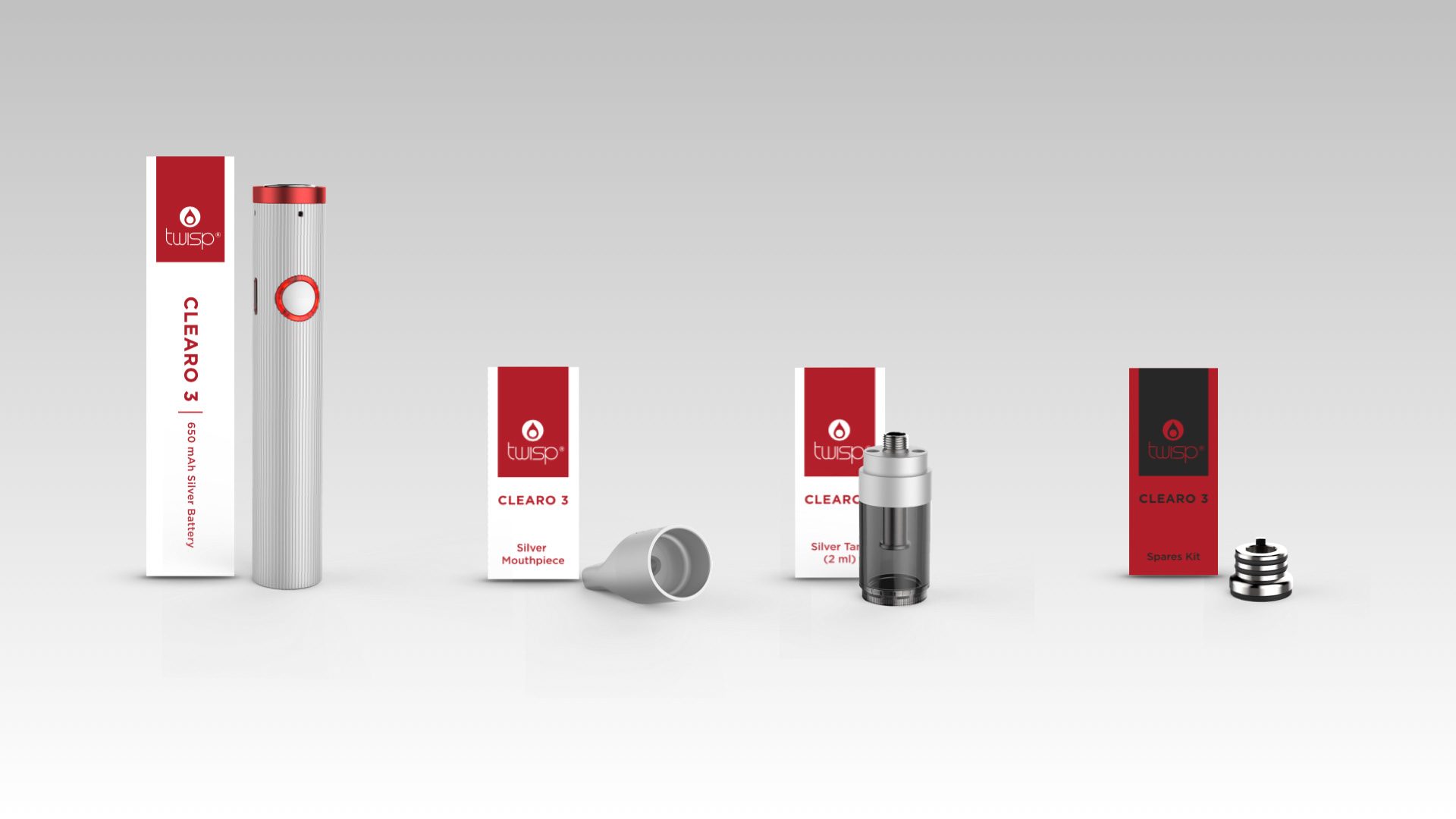
PACKAGING DESIGN
CAMPAIGN LOOK & FEEL


Packaging & Marketing Design: Samantha Morrison - Product Design: Mic Lazzari - Rendering: Heinrich Botha